Give Get Design

Give Get Design

Give Get Design featuring great design, architecture, fashion, graphics and innovation from across the globe.


Time Capsule

The book is about the history of graphic design. Designer want to engage audience in a more dynamic narrative experience and help them at the same time to understand the book more easily. In order to hold audience's interest, adding interactiveness to the book, designer make the book look like have long history as cultural relics, this book attempt to guide the audience to wear dust prevention gloves and take up brush and magnifier, act like archaeologist to research the history. It is a book that requires the audience's actions and also to be handled and experienced.

Continue reading


Architectural Traces

On the spine of the Dalmatian architect that has not bent in front of insatiable investors, which are consistency, stress, and years spent in a chair, the designer notices some different architectural, more painful, traces. Looking from a distance at the sloping side of the cover, they resemble a roof with typical Roman tiles. It is created by the optical illusion of images of the actual Magnetic resonance of the architect's spine, which can be seen when you approach the book. They reveal the hidden, painful reality of a responsible architect, the one behind the buildings people admire.

Continue reading


Music of the Skalne Podhale Region

The publication is an anthology of the most important and beautiful highlander melodies and songs. It consists of 3 volumes: "Theories", "Finger notation" and "Music notation" as well as recordings. The graphics on the covers refer to the mountain horizon view and sound recording in a music editing program. It is also an optical illusion of a reflection in the water, as well as a reflection of the notes: note and finger, which represent the same content in two different forms. The use of raw linen and red threads is a reference to traditional highlander costumes.

Continue reading


Chadao

The cover materials and colors of the hardcover are used to create a clear way to present the typical colors of Pu'er tea. The font design and layout are properly left blank, and the overall layout is full of changes. Modern design language is used to explain the charm of Chinese Pu'er tea, and the chapter design is simple and clear. The pictures and content are well matched and interesting. The graphics and text are harmoniously and properly presented.

Continue reading


Simple BIO Wine

Illustrations and catalogue design for Simple Wine company, which import and sell alcohol and water. Main task of this illustrations was to show organic, sustainable and natural wines, which company offering to clients. All illustrations realized in "paper cut" style where main contour and color sketch was created in Illustrator, and after that was painted and finished in Photoshop.

Continue reading


Zodiacville Runners

Zodiacville Runnersl is a children's fairy tale about Zodiacville's animals participated in the running festival hosted by the Dragon King. This project is an experimental mixture of traditional Korean 'minhwa' attributes and illustrator's own digital painting styles. Accordingly, folkish episodes of zodiacville animals are based on the humorous and joyful sentiment of the festival. Furthermore, numerous dilute dots were blended layer by layer, inspired by the oriental back-painting technique.

Continue reading


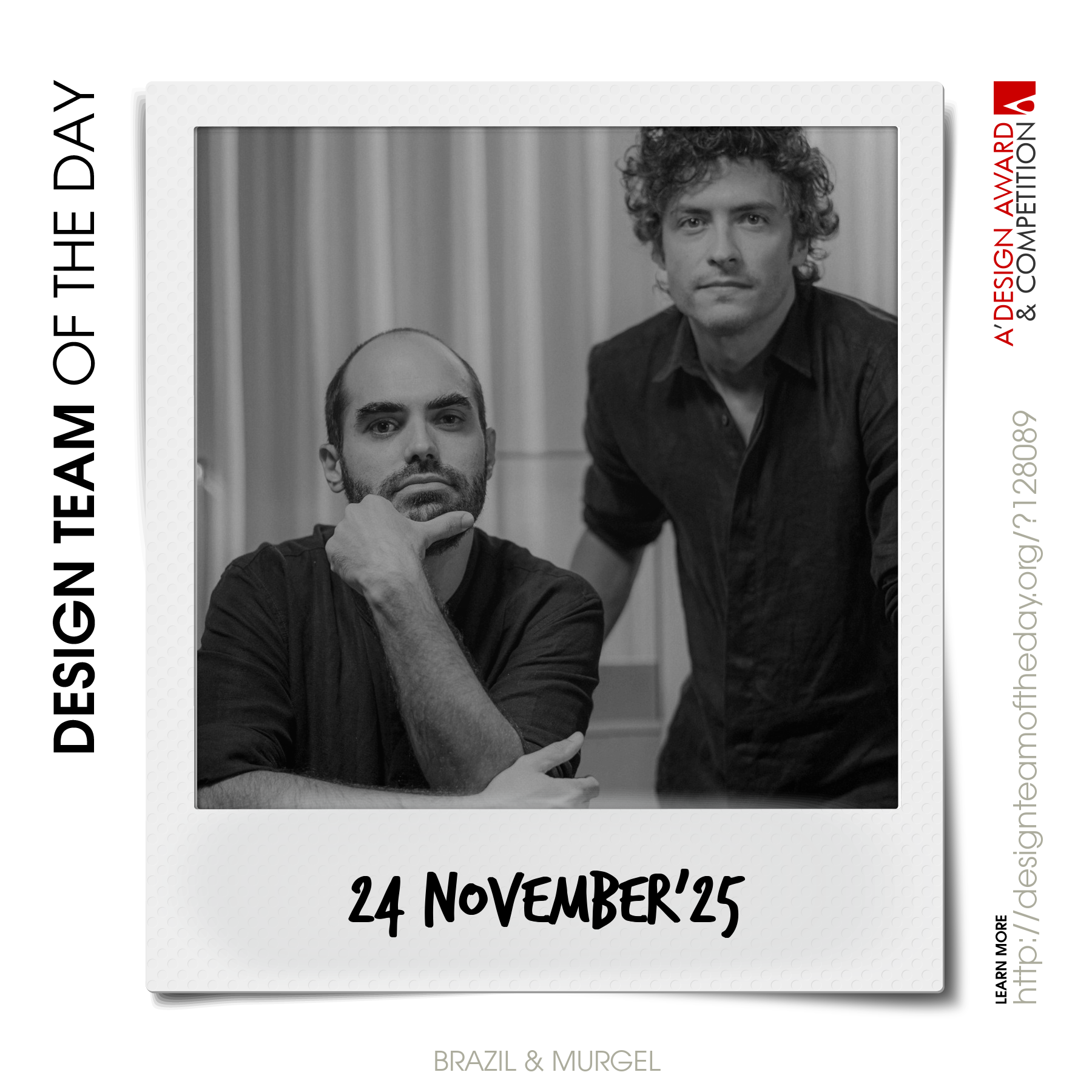
World's greatest design teams.

Sometimes you need a very big team of talented designers to come up with truly great designs. Everyday, we feature a distinct award-winning innovative and creative design team. Explore and discover original and creative architecture, good design, fashion, graphics design and design strategy projects from design teams worldwide. Get inspired by the original works by grand master designers.

Continue reading